INFLUENCES /
ADMIRATIONS
ADMIRATIONS
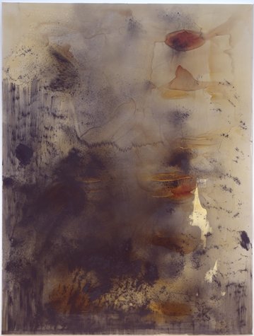
Artistic and emotional freedom has made these paintings possible; freedom to explore the vocabulary of a wonderful array of colour, and freedom to express from the heart. The result of that freedom is a multi-layered and unpretentious approach that reveals a state of mind; a set of powerful paintings, which are confidently struck and honest.
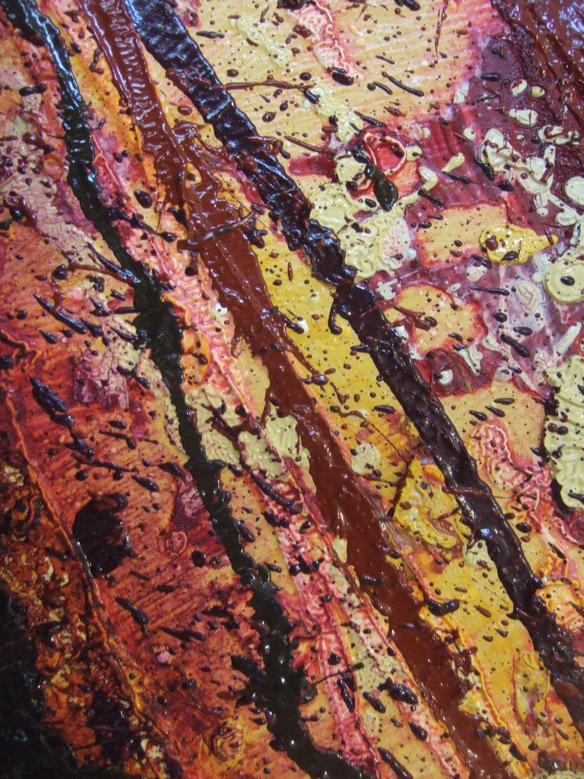
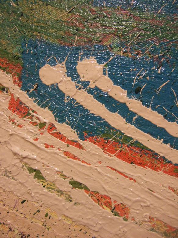
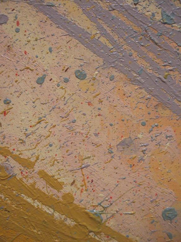
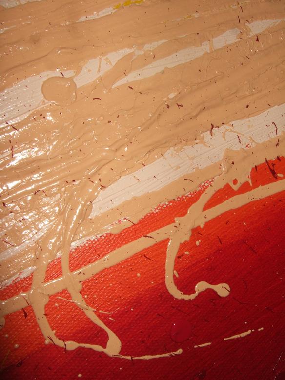
The paintings are highly colour driven, and non-figurative. They enjoy varied methods of application, which can be: heavy & thick, with brush bouncing over surface undulations; stretched so thin the underlying layers shine through; dropped and dotted; or fast & linear. These varied methods lead to an absorbing surface (which is made very apparent when light shines through the canvas) with interest from shape, edge and texture; even down to the detail, but does call for a controlled palette and simplicity of composition. Colour choice is sensitive to hue and - most critically – tone; juxtaposing colours to their mutual advantage, and utilising the variations in opacity and translucency that each particular colour bears.
Intuitive and gestural from the outset - each piece is allowed the freedom to evolve in its own particular direction, often requiring several revisits even spanning years, when fresh colour is laid over existing dryer layers. This adds further interest, and introduces a sense of Process, which is an element that I am particularly keen to uphold.
It is my general practice to split the picture plane with a non-horizontal band of colour. Surface texture, the contrast of opacity & translucency, and varied thickness has all played an ever significant role in maintaining interest as this band has developed into increasingly large fields.
The edge of the canvas actually often reveals a telling history, showing layers of colour which may have been entirely overpainted on the face of the work itself. For this reason I value the rather "messy" edges and do deliberately keep them so.
The finished pieces undoubtedly bear emotive overtones; and I hope allow the viewer a special and personal involvement.
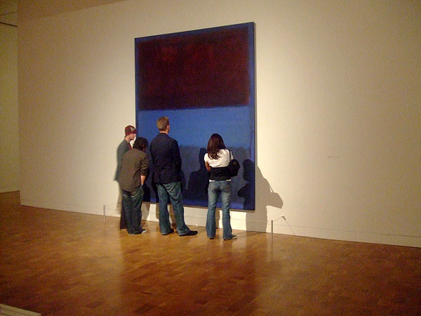
I hold the work of Mark Rothko in very high regard; enormously powerful paintings, stripped-down and emotive. My work draws on such ethos, but also allows for strength in markmaking, with line, edge and layer playing a significant role.
I justify my work against him because Mark Rothko is a Giant in my eyes.
I justify my work against him because Mark Rothko is a Giant in my eyes.
Sir Howard Hodgkin for describing painting "as a process of substituting an object for a subjective feeling".
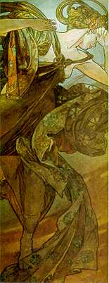
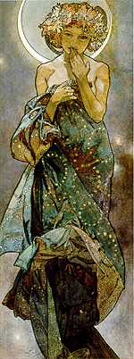
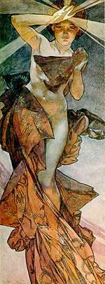
The deliberate use of line and shape in the work of Alphonse Mucha is a sight to behold.
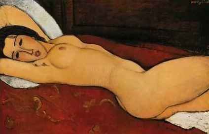
Amedeo Modigliani - master of female depiction, and bold canvas split.
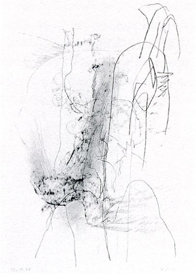
The drawings of Gerhardt Richter.
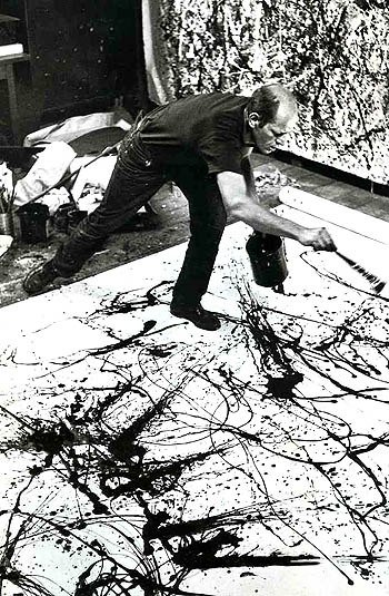
Jackson Pollock - "Jack the Dripper"; for freeing us.
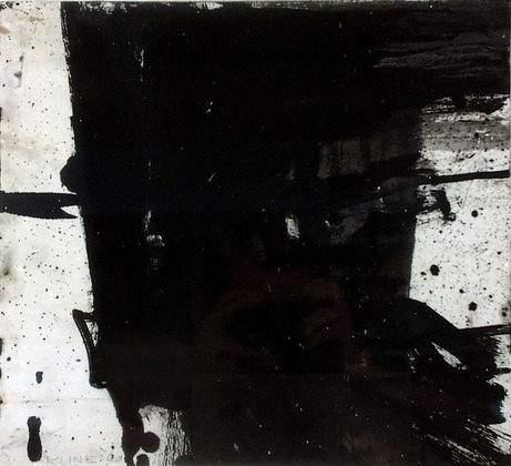
Franz Kline;
such strong tonal blocking.
such strong tonal blocking.
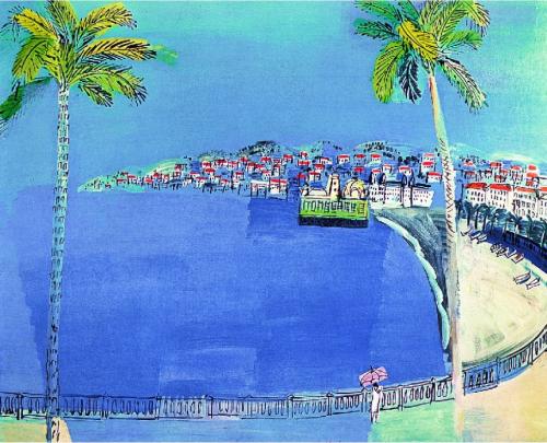
Raoul Dufy;
objects breaking through coloured outline.
objects breaking through coloured outline.
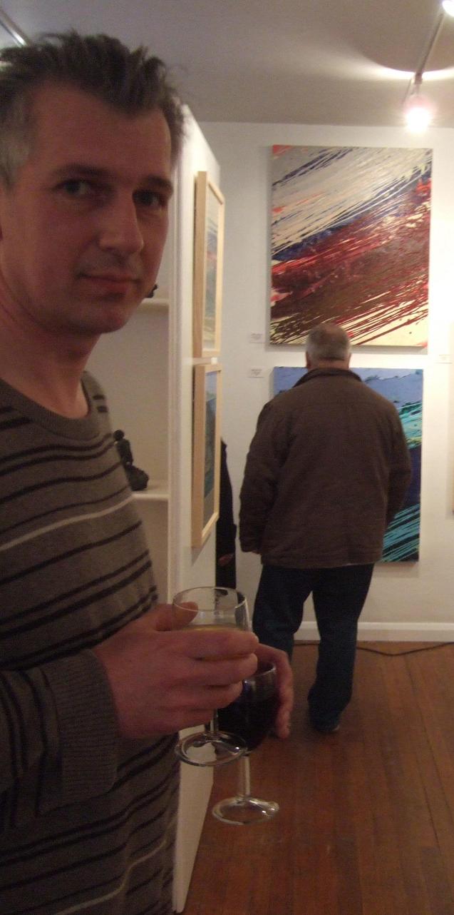
STATEMENT
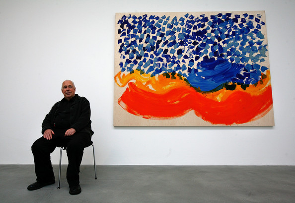
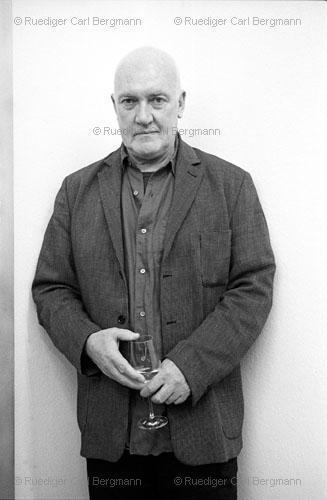
PROFILE
Formal Art training started at Trent Polytechnic in Nottingham, where I focused on honing my colour manipulation and draughtsmanship skills through copying the Old-Masters, and life-drawing, through which began a lifelong love of and respect for line.
I moved on to a Fine-Art degree at Portsmouth Polytechnic, specialising in painting. My work then was figuratively derived, although did develop into having areas of colour breaking through coloured outlines, exploring surface tensions and imbalance.
Over the years I have led several varied workshops. Commission work led to producing massive (20'x10') backdrops for photographic studios. My style has matured to be less figurative, more energetic and gestural, giving high priority to colour combinations, evidence of process, and surface.
I am now based in Ilfracombe on the beautiful North-Devon coast, and produce both small and relatively large, contemporary oil paintings which aim to grace the discerning home with an interesting focal point.
I use quality French, Dutch, English & German oil paint with good colour-fastness, on deep-edged, cross-braced, triple-primed canvas, and also for some smaller and most recent pieces; on unprimed but sized linen. I work generally to an impressive, but still domestic, size of approximately 80cm x 100cm.
CONTACT
If you have any questions about the work: viewing, or purchasing it; please do get in touch.
Thankyou for visiting!
creydi@uwclub.net
Thankyou for visiting!
creydi@uwclub.net
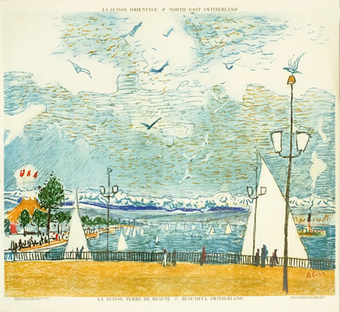
Alois Carigiet handling colour with a graphical markmaking approach and delicacy of touch.

See a short studio talk
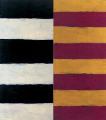
Shaun Skully's sensibility of color.
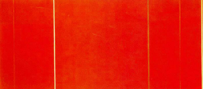
The monumental "zips" of Barnett Newman.
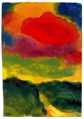
Emil Nolde's unpainted pictures.
"The spirit flies on ahead; reality, earthbound and deliberate follows".
"The spirit flies on ahead; reality, earthbound and deliberate follows".
The large nickel and artificial resin works of Sigmar Polke have notable depth and layering.
Tracey Emin.
Inimiitable, Honest. True.
Her work is a mirror.
To me. To you.
Inimiitable, Honest. True.
Her work is a mirror.
To me. To you.
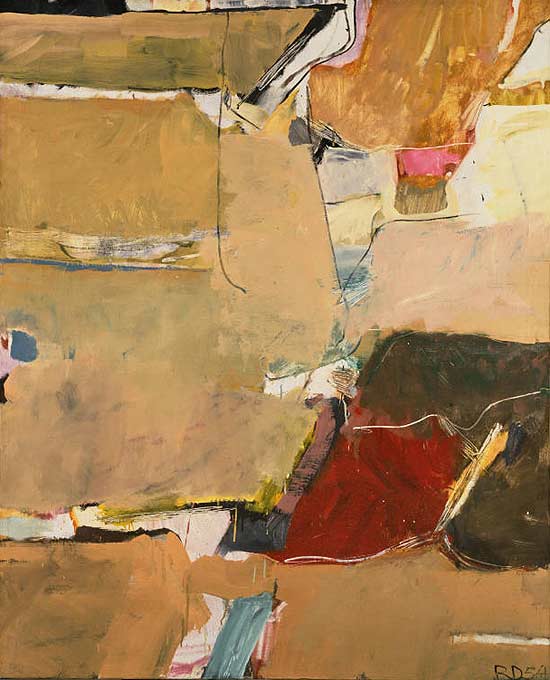
Richard Diebenkorn - very clever with colour temperature and spatial handling.