COLOURS
Colour is key. The palette at your disposal is as vocabulary to speech. How you then choose from the colour, and how you use it, is something that comes from your very self.
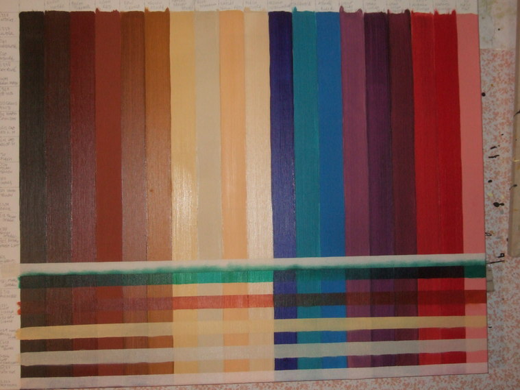
I have been asked why I have so many colours - why I don't just mix them. I do of course mix, but some colours simply cannot be - the beautiful opacity or translucency - the dense darkness or crisp clean brightness is often unattainable by mixture. So I have broadened my range and have some of them pictured here on their individual colour squares - laid thickly, thinly and broken with white. These squares are my everyday referance - by holding them up to a piece in progress, by comparing and contrasting I move my work forward in directions it naturally wants to go. They are my map, my pathway.
I have been asked why I have so many colours - why I don't just mix them. I do of course mix, but some colours simply cannot be - the beautiful opacity or translucency - the dense darkness or crisp clean brightness is often unattainable by mixture. So I have broadened my range and have some of them pictured here on their individual colour squares - laid thickly, thinly and broken with white. These squares are my everyday referance - by holding them up to a piece in progress, by comparing and contrasting I move my work forward in directions it naturally wants to go. They are my map, my pathway.

Studies - small square stripes group.
Studies - stripes triplet.


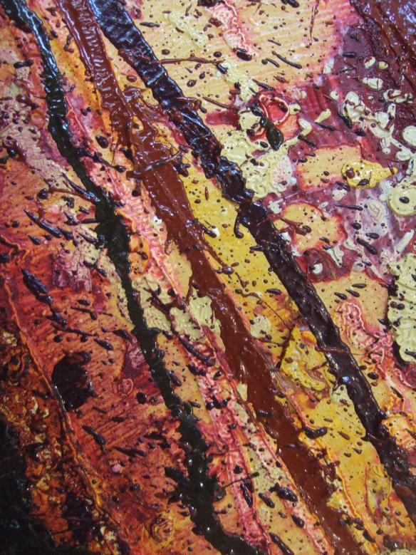
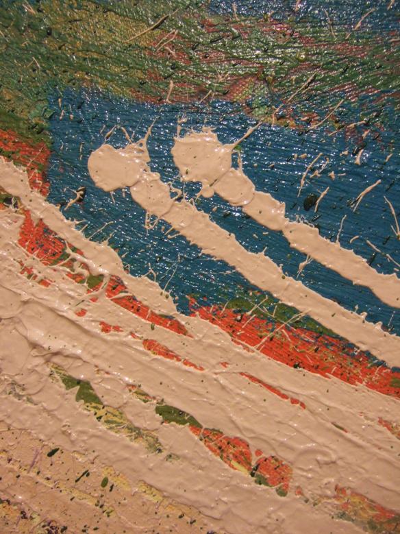
The look of a colour is radically affected by it's neighbour - I have experimented with a couple of stripey series exploring this. See "small square stripes group" and "stripes triplet".
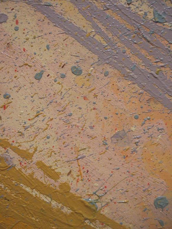
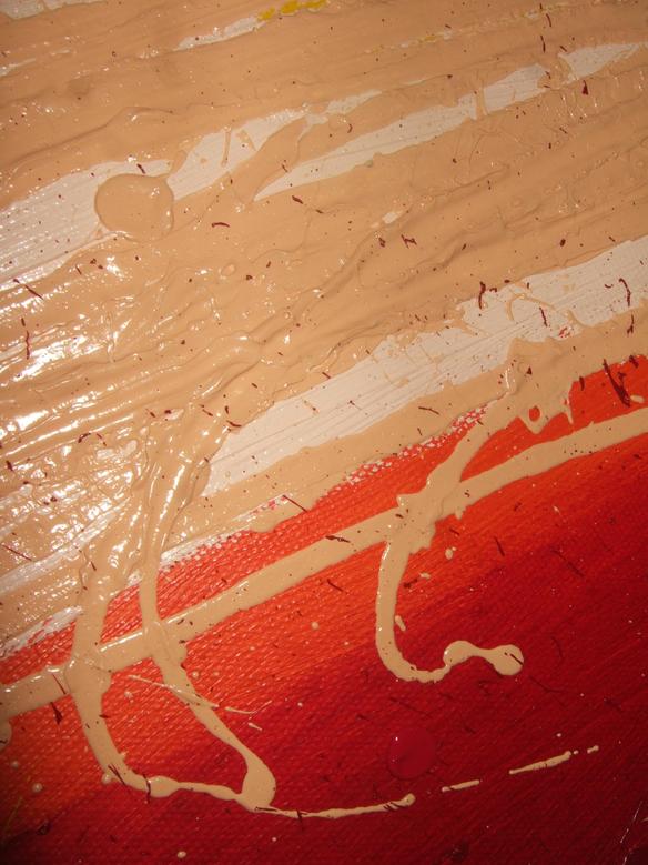
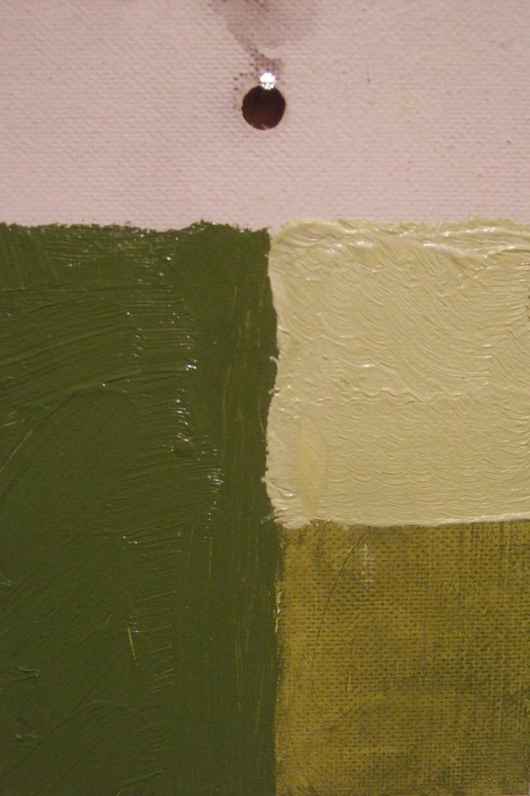
A colour (especially a translucent or thinly stretched one) is also radically affected by the base colour over which it is painted. I am currently painting a canvas which sets a number of colours upon different coloured bases to determine the effect of this and provide me with a further point of referance.
A colour (especially a translucent or thinly stretched one) is also radically affected by the base colour over which it is painted. I am currently painting a canvas which sets a number of colours upon different coloured bases to determine the effect of this and provide me with a further point of referance.
In order to achieve the heavy gestural application I obviously mix paint up in quite large quantities - I use plastic containers for this, and also reuse them allowing for experimentation in colour combinations and overlays. I keep the successful containers in an ever growing stack, which I am able to refer to when working out the best way forward for a work in progress.